
A catering brand, built to be booked
A full identity system and a website organised around the six ways people actually hire a caterer.
Client — BBN Caterer, Ludhiana
One mark, three jobs
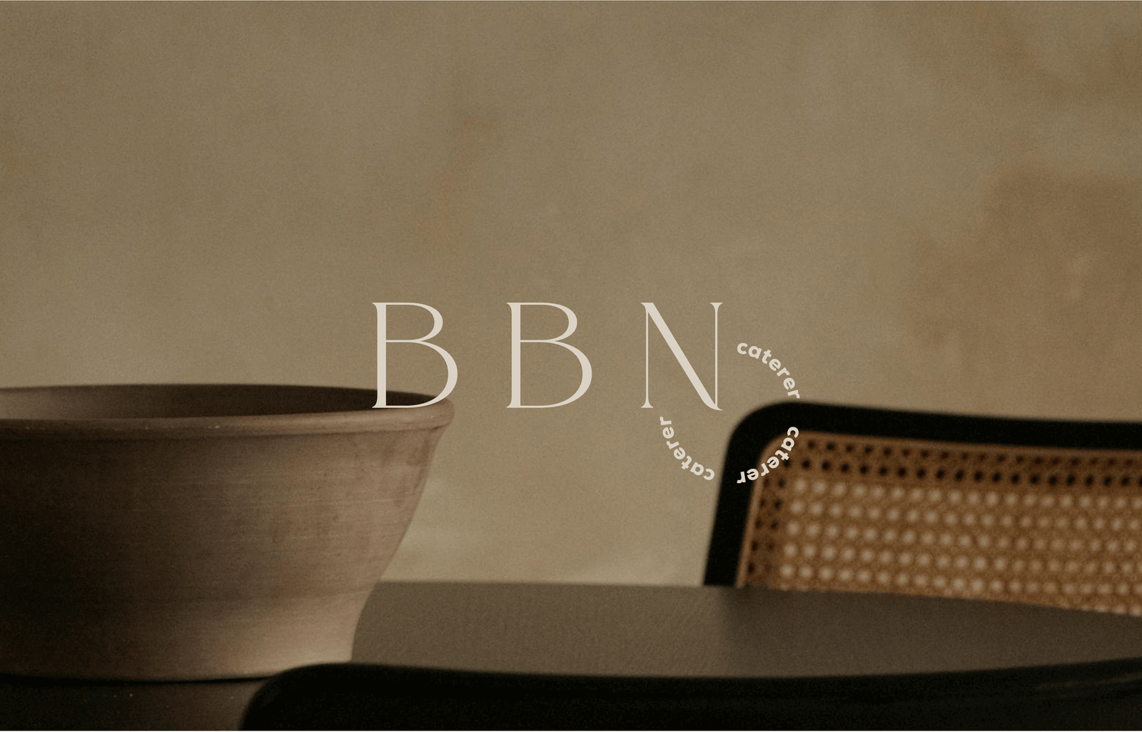
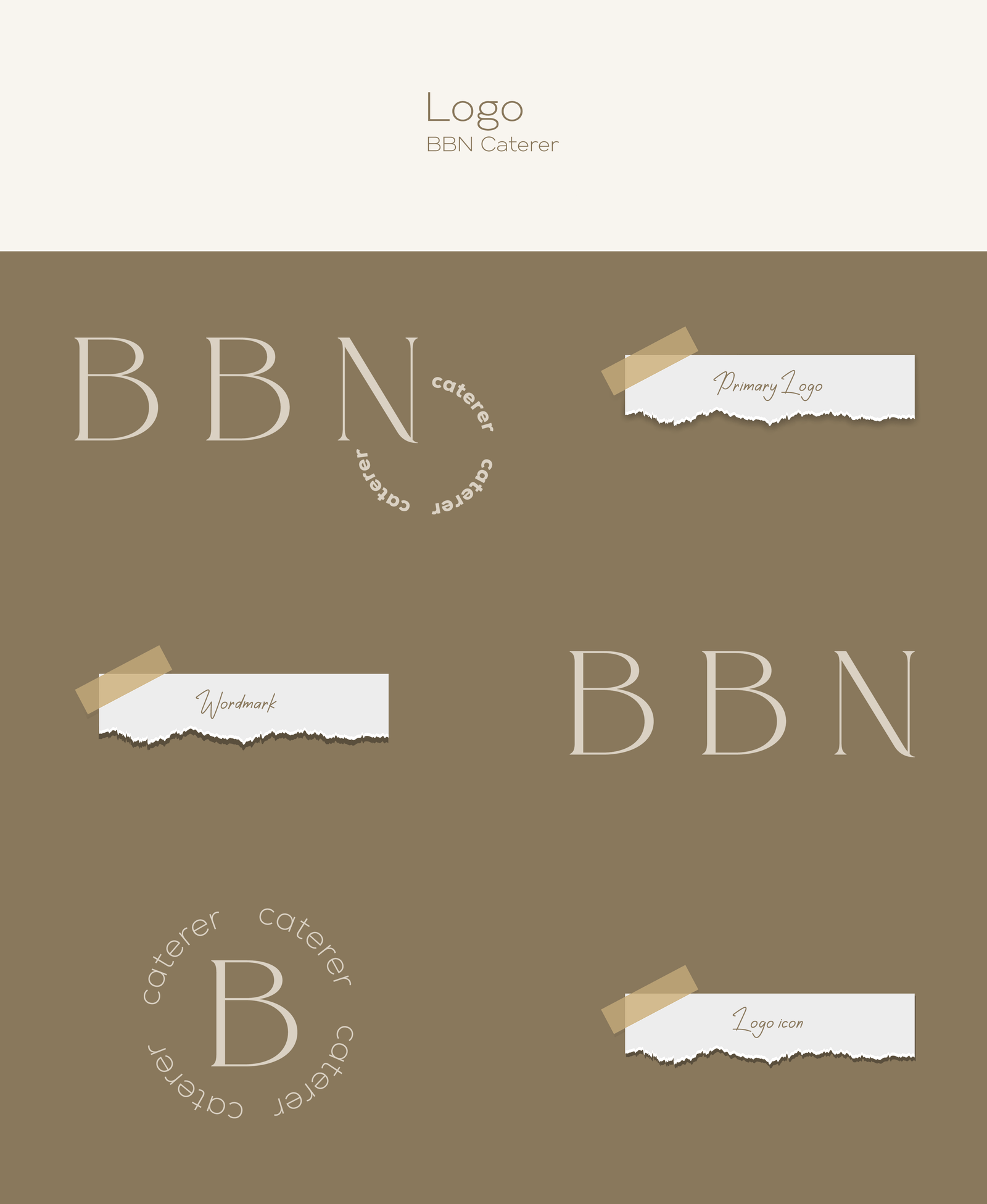
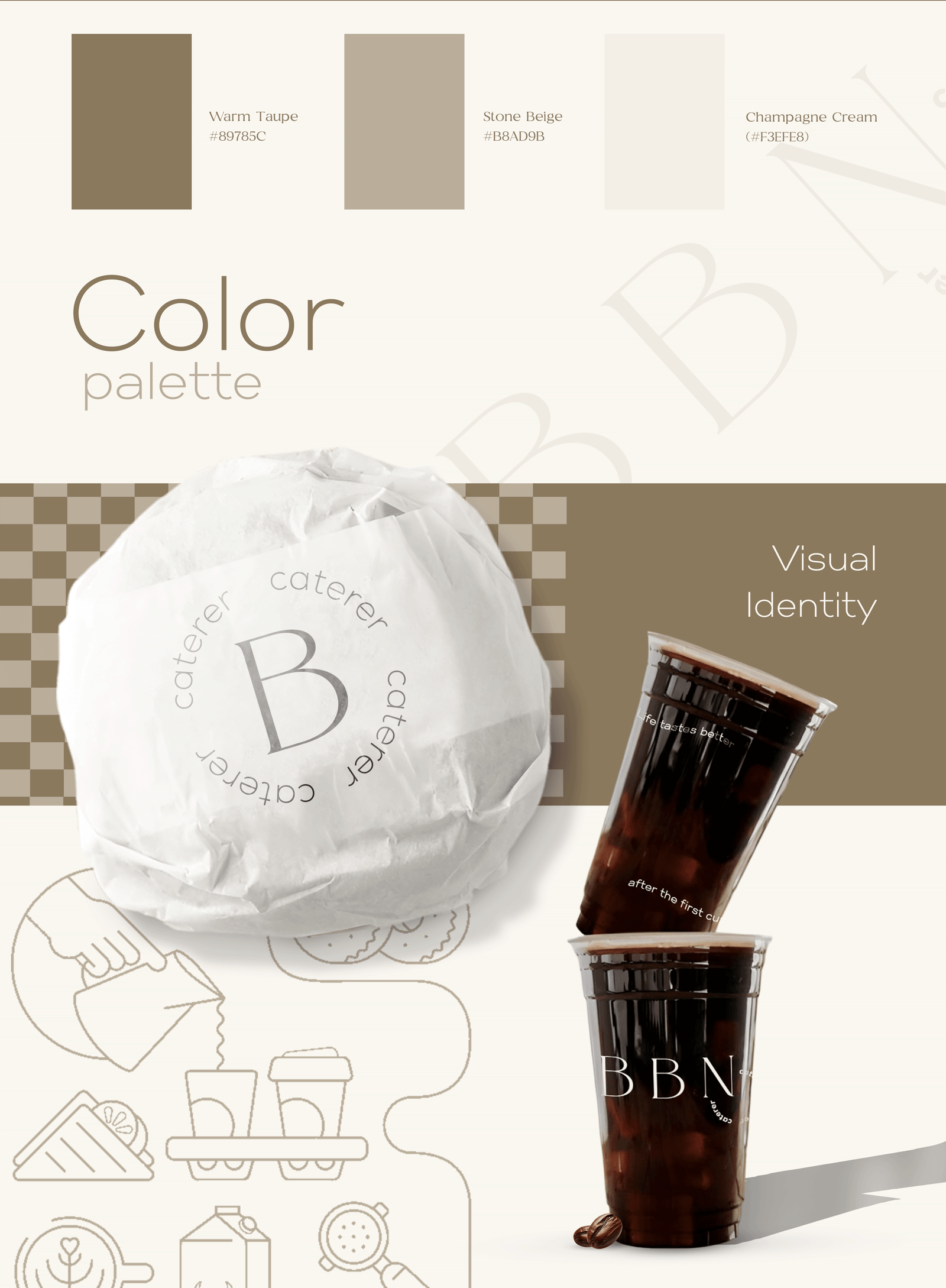
A catering brand has to work on a marquee, on a van and on a phone screen. We built the identity as a set rather than a single logo: a primary mark, a circular “caterer” lockup, an icon for small and square placements, and a wordmark for wide ones — on a palette of Warm Taupe, Stone Beige and Champagne Cream.
A voice, not just a mark
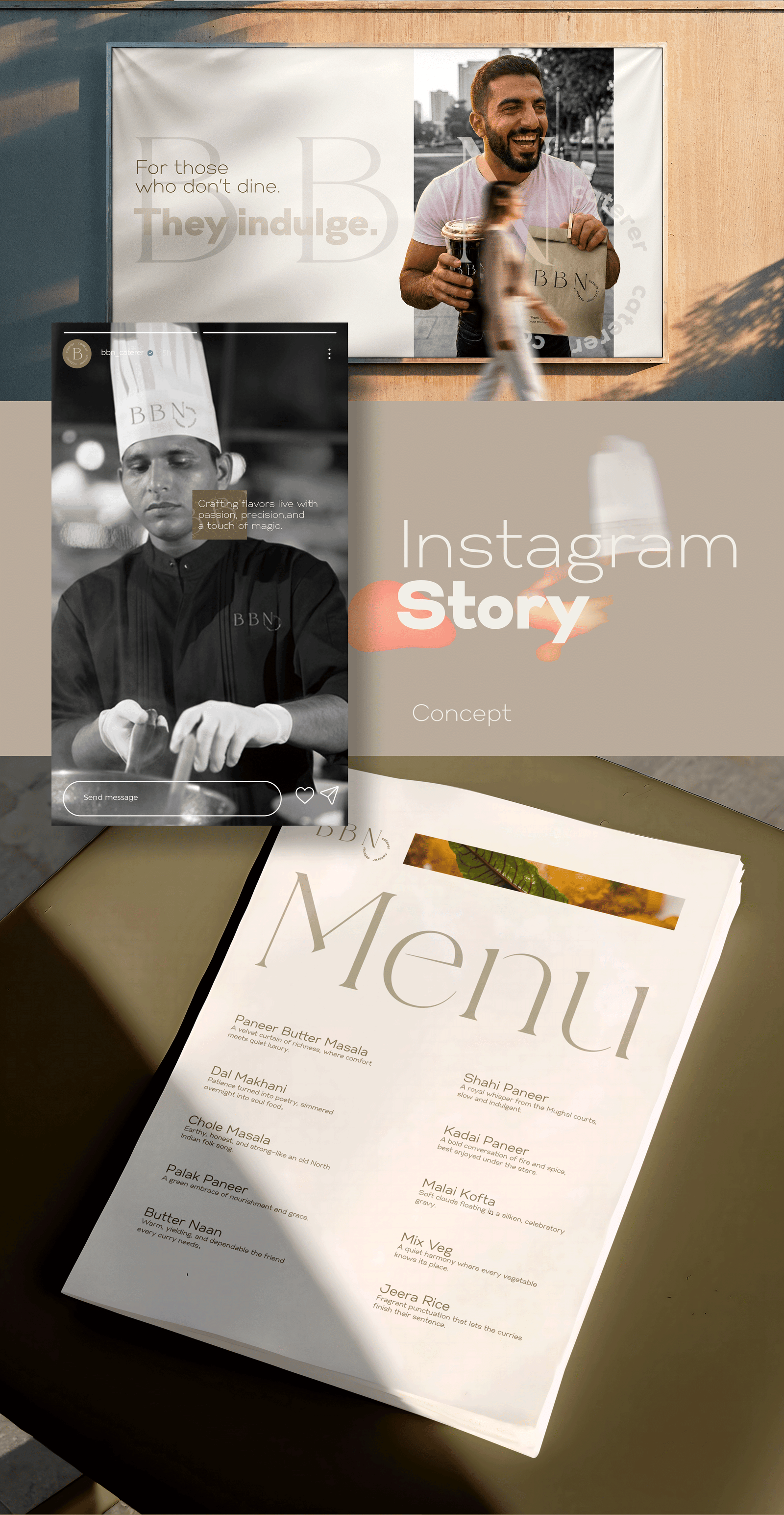
The identity carries a line — “For those who don’t dine. They indulge.” — and the menu is written to match it, with each dish given a sentence rather than a label.
Designed across every surface
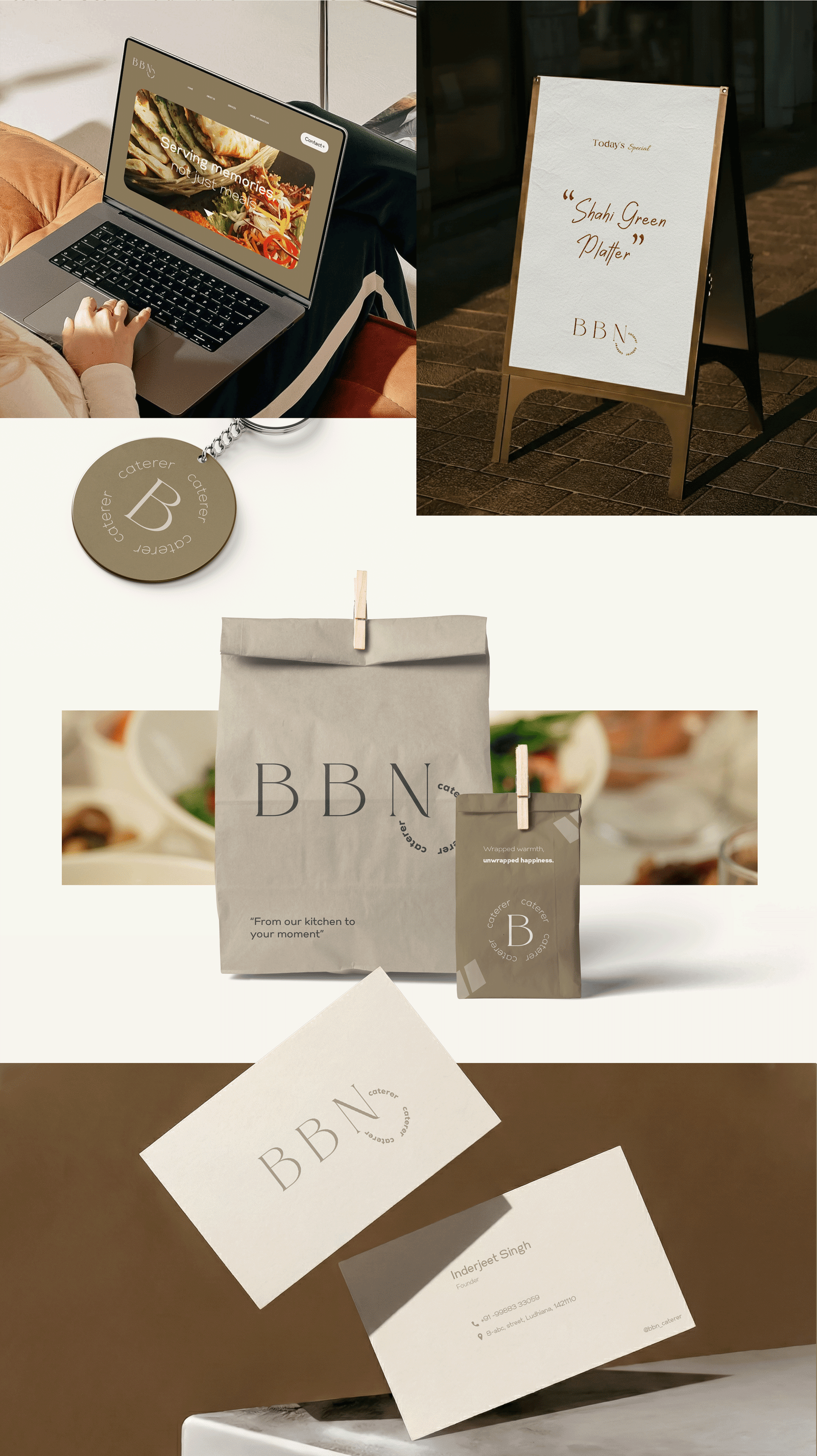
The system was drawn out across the surfaces a caterer actually meets guests on: takeaway bags, cold-cups and food wraps, printed menus, business and thank-you cards, chef whites, an outdoor hoarding, and a social template set.
Structured around the enquiry
The website is organised by occasion, not by service jargon, because that is how the enquiry arrives — someone has a wedding, an office function or an outdoor event, and needs to see that specific thing done well. Each of the six occasions got its own page and its own written copy.